BLOG
How colour influences guest behaviour in hotels
More than design: colour shapes the guest experience
Hotel design is about more than visual appeal. It influences how guests feel, behave and remember their stay. While materials, lighting and layout all play a role, one of the most powerful and often overlooked elements is colour.
At Bentley Europe, we do not design interiors, but we do help elevate them. Our carefully selected in-room hotel supplies are created in timeless, neutral finishes that integrate easily into a wide range of interior styles. For hotels with a strong visual identity, we also offer customisation and bespoke options that ensure every detail supports the mood and brand atmosphere you want to achieve.
In this article, we explore how colour affects guest psychology, mood and behaviour, and how thoughtful choices can turn an ordinary stay into something truly memorable.


Colour sets the mood before words are spoken
From the moment a guest enters your lobby, colour speaks first. It sets the emotional tone long before any interaction takes place. Whether the atmosphere calls for calm, intimacy or understated luxury, colour makes the first impression.
A soft taupe palette with warm gold accents creates a sense of sophistication and ease. A deep navy corridor with subtle brass details suggests quiet confidence. Whether guests consciously notice the colour choices or not, they feel the mood you have created.
Different colours create different behaviours
Each colour evokes specific associations that influence how guests feel and act. Below are examples of how colour can support different guest experiences.
BLUE
Blue brings a sense of calm, clarity and trust. It is ideal for spa areas, suites or executive lounges. Light blues encourage relaxation, while darker shades communicate elegance and discretion.
GREEN
Green reflects nature, balance and renewal. It works well in wellness-oriented spaces or properties that focus on sustainability. Soft sage, olive or forest tones invite mental clarity and a grounded sense of calm.
NEUTRAL TONES
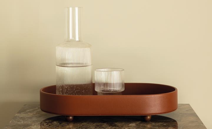
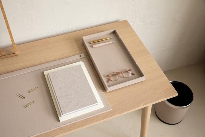
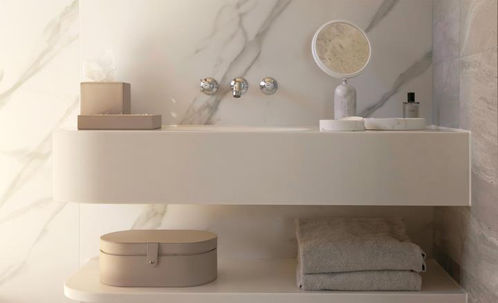
Such as beige, stone or sand. These tones are timeless and create a sense of safety and quiet luxury. They are especially effective when paired with tactile materials like brushed wood, leather or soft fabrics.
RED
Red is bold and energising. Use it strategically in areas where energy and attention are key, such as bars or social spaces. Burgundy adds warmth and intimacy, while bright red can be stimulating and is best avoided in sleeping areas.
BLACK
Black is confident, dramatic and refined. It anchors a space and provides contrast. To avoid a cold effect, pair it with soft lighting or warmer materials.
YELLOW AND ORANGE
These colours suggest energy and optimism. When used sparingly, they add freshness and vibrancy. Consider them for cafes, lounges or creative areas, but avoid overuse in quiet zones.
| Colour | Key Associations | Ideal Use | Details |
|---|---|---|---|
| Blue | Calm, clarity, trust | Spa areas, suites, executive lounges | Light blues encourage relaxation; dark shades imply elegance and discretion |
| Green | Nature, balance, renewal | Wellness-oriented spaces, sustainable properties | Sage, olive, forest tones invite mental clarity and calm |
| Neutral Tones | Safety, quiet luxury | Timeless and luxurious environments | Works well with brushed wood, leather, soft fabrics |
| Red | Bold, energising | Bars, social spaces (avoid in sleeping areas) | Burgundy adds warmth; bright red can overstimulate |
| Black | Confident, dramatic, refined | To anchor spaces and create contrast | Avoid cold effect by pairing with warm or soft materials |
| Yellow and Orange | Energy, optimism | Cafés, lounges, creative areas (use sparingly) | Adds freshness and vibrancy; avoid overuse in quiet zones |
Colour is not just visual, it is emotional
The most memorable hotels are not only beautifully designed. They make guests feel something. Colour is often the element that connects the visual design to the emotional experience. When used intentionally, colour influences how guests unwind, sleep, engage or disconnect. It shapes the pace of their stay, the comfort of their room and the memory they take with them.
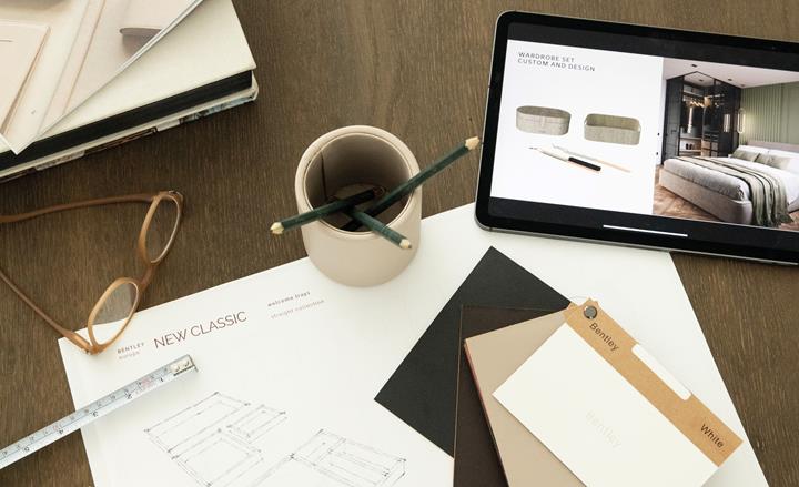
At Bentley Europe, our hotel room supplies are designed to support that emotional layer of hospitality. From laundry boxes and turndown trays to wardrobe organisers and accessories, we create refined solutions that align with your design language and your guests' expectations. Through our customisation service, we also help you reflect your brand’s character in every shade, texture and material.


Ready to explore what colour can do for your guest experience?
Our specialists are here to support you in creating an in-room experience that is both elegant and intentional. Whether you are starting from a mood board or looking to refine an existing concept, we can help you choose hotel supplies that align with the emotional tone of your brand.
Let us help you translate design into experience, one thoughtful colour choice at a time.